What do you think of Volvo’s new LOGO?
Article Source: LOGO Master ID: Logods Image Source: Volvo official, Weibo (invasion and deletion) Author: Da Jun Editor: Ai Sheng
Early this morning.
Da Dajun received the explosion information from fans.
Volvo cars have changed their LOGO!

what? Volvo, this is not about putting
Replace the classic ring LOGO …
As we all know, Volvo’s original LOGO
Its outer frame is in the shape of a ring with an arrow.
It has the meaning of a wheel, with a diagonal across it in the middle.
Make the whole more "stable"
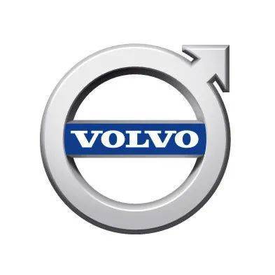
And the text part is highlighted with white characters on a blue background.
It is also the symbol registered by VOLVO company.
It’s in ancient Egyptian font

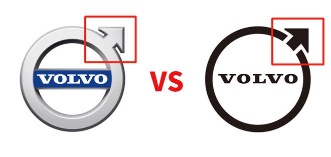
You can see that the original LOGO
It presents a three-dimensional effect by adding shadows and metallic textures.
And the new LOGO becomes flat and flat!
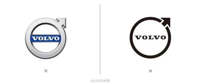
The new LOGO removes the metallic texture.
And diagonal elements in the middle.
The combination of circle and arrow is kept in a flat form.
And the word "VOLVO"
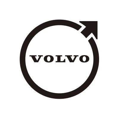
Where the circle and the arrow in the upper right corner
Designed by the original closed form
The space is processed.
And the design of words
The previous serif fonts are used.
Only the distance between letters has been adjusted.
Make it look more "loose"

Speaking of which, let Dajun think
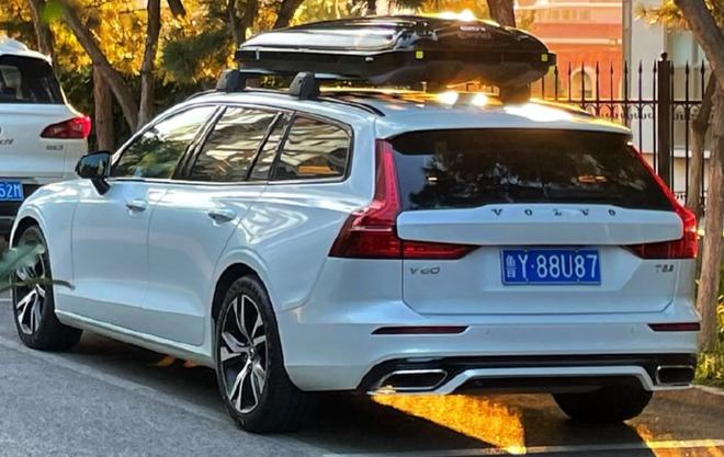
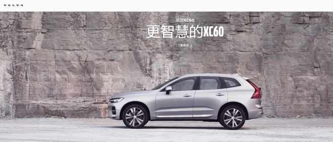
Another Volvo logo

We’re behind the Volvo car
And you can see it on the website.
The word "long distance"
So
The routine for Volvo to change the logo is
Keep the font and distance?

On the whole, the new LOGO is designed in a minimalist style.
Become younger, more modern and have affinity.
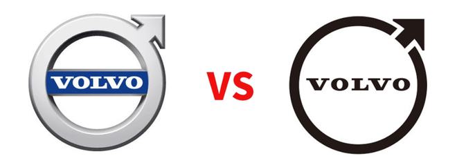
At present, the new LOGO of flat wind
It has been used in various channels.
Official website page
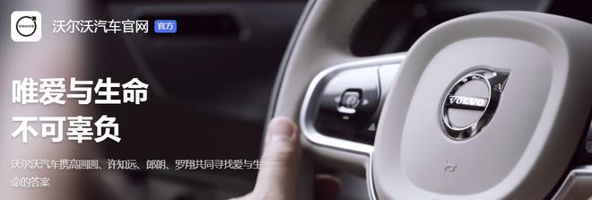
official microblog

And on the APP icon
In addition, in Volvo this June,
Launch a new pure electric concept car
You can also see the use of the new LOGO.
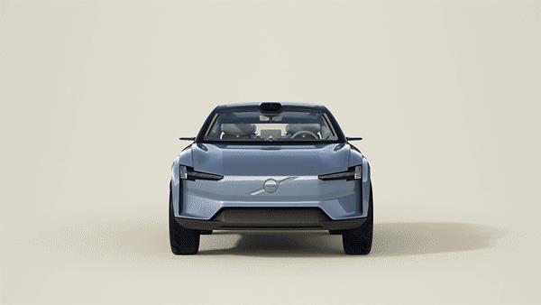
For the release of Volvo’s new LOGO,
Undoubtedly caused a heated discussion among netizens.
Some people think that flat design conforms to the trend.
But the new LOGO has a thinner ring.
It makes people feel uncomfortable

Some fans also said that
Still prefer the original LOGO.

There are even people who "digress"
Driving in the comments section?

(imagine for yourself)
However, this flattening operation
Some people also think of the public before.

The new LOGO is also flattened.
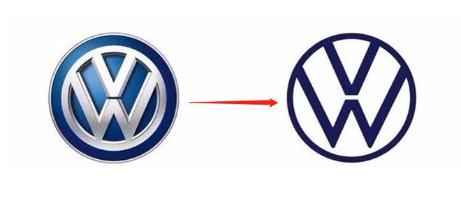
Speaking of which, the operation of Volvo’s new LOGO
Flatten+remove text bottom frame
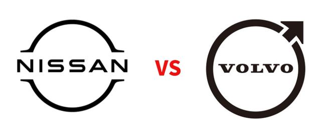
It also reminds Dajun of Nissan, which released a new LOGO last year.
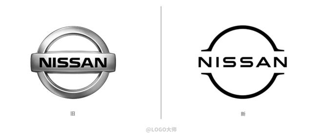
This routine, is it the same!
Put the new LOGO of the two brands together
Is there a feeling of "two brothers"
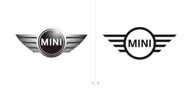
In fact, from the perspective of the global automobile industry,
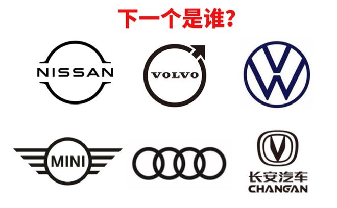
Starting from the MINI owned by BMW in 14 years,
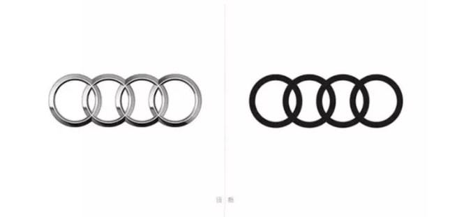
The trend of flattening of automobile brand LOGO
It got out of hand.
Audi
Changan automobile
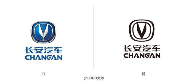
This is because many automobile brands are carrying out electric innovation.
Competing to launch and improve the product line of electric vehicle series
The minimalist and flat LOGO can better show the sense of science and technology that enterprises need.
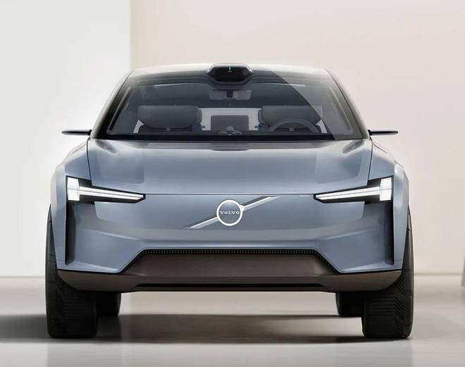
In addition, it is probably influenced by the current information age.
Nowadays, electronic screen is the main information carrier.
Therefore, the minimalist style of "less is more" simplifies and centralizes the content.

On the one hand, this will make the brand better publicized.
On the other hand, it also gives designers more room to play and imagine.
So, in the automotive industry,
Who will join the flattening team next?
